Combined with our logo, brand colors and typography, graphic elements help tell the unique Illinois story.
Used alone or in combination, these elements are aligned with the university’s pillars and help create a distinct look to our brand. For your convenience, we’ve collected the brand colors and graphic elements in an Adobe CC Library. Email us for access.
Gradients

Gradients are a useful tool for putting text over busy images or when you want to add brand colors to a design. When adding gradients to images, the provided gradients create a more dynamic layout. Only orange, blue or white gradients should be used. Please avoid combining orange and blue to create a gradient — this results in muddy mid-tones as the colors meet.


Textures
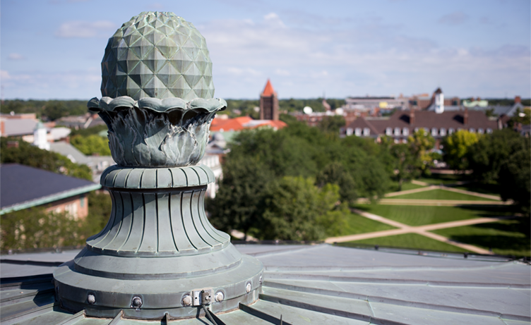
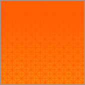
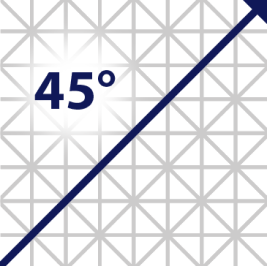
Finial pattern

Inspired by the many finials found atop campus buildings, this modern interpretation gives a nod to our history and traditions. You can also use the finial pattern to create a grid for your designs.


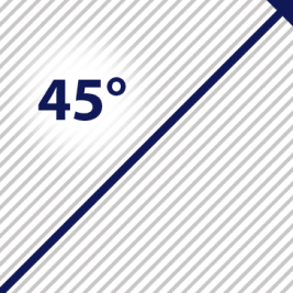
Ascending lines

Ascending lines reference the forward momentum of the university. They can be used as a connecting element or background texture. The lines should always be at 45-degree angle and move up to the right.

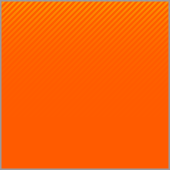


Keeping consistency
The finial pattern and the ascending line elements are built around a 45-degree angle. Never change the angle of these lines. Keeping this angle consistent will ensure your designs are more uniform from piece to piece, allow you to use multiple elements harmoniously and align your work with other designs produced around campus.
Hosted brand assets for web
Our textures have been added as patterns and backgrounds to the collection of hosted brand assets, also known as a content delivery network (CDN), so you can implement them to your website with simplified variable names. Find the documentation on all the hosted brand assets.
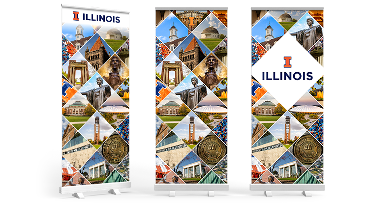
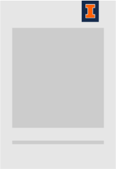
Photo Treatments
Block I frame

The framing element mimics the curve of the Block I. Create this element by rounding one corner of a photo frame to match the inside curve of our Block I or by layering a box with a rounded corner on top of the photo.

Gradient maps
Gradient maps are useful in a variety of scenarios:
- When text is layered on top of images.
- When you want to incorporate photography while still emphasizing a stand-alone message.
- When you want to incorporate more branding into your design.


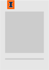
Tabs

There are some instances when you need to separate the logo or wordmark from the background. In those cases, use the tab element.
Block I tab


Primary Wordmark tab


Formal Wordmark tab


Tab placement and usage


Iconography
To give users a more consistent experience on university websites, we’ve created a custom icon library that covers many of the icons most commonly used across campus websites. This can especially increase clarity by standardizing the use of icons that accompany common actions such as “apply now” or “give.”
- Three different icon styles (solid, outlined and two-toned) offer flexibility. As more imagery is needed campuswide, the library will be expanded.
- If there’s an icon need that’s specific to a single unit, college or program, we encourage you to supplement this set with the icons available through fontawesome.com, or to create custom icons that are visually similar in style to the library we have provided.
- You may change the color of the icons in this library to any of the colors presented in our brand guide that best fit your need.
- Our icons are available to download as .png, .svg or .ai files.
- Icons have also been integrated into the collection of hosted brand assets to make them quick and easy to implement across the web.